Hello Everyone, Today You'll find How to Create a Histogram in Excel. A histogram is a tool of Analysis ToolPak in MS Excel. It is used to represent the data in the graphical form and use the column chart to display frequency data . To create a Histogram in excel you need to organize the data into two column. You can easily analyze the data using the histogram tool in the MS Excel. In this tutorials, you will find the method to use the histogram and create a chart by using it.
How to Enable a Histogram using Analysis ToolPak
A histogram is a column chart that visualizes how to make the frequency excel data represent in two column on the spreadsheet. The first column represents the input data and the second column represents the bin numbers. Input data is the data that you want to analyze and bin numbers are the data intervals on that you want to apply histogram tool for measuring and analyze the data. For use the histogram first you need to install Analysis ToolPak in your worksheet. To enable Analysis ToolPak click here.
Creating a Histogram in Excel
For creating a Histogram in MS Excel worksheet first, you need to enter the particular data into two columns so make an excel worksheet with two columns data.

After entering the data on the worksheet you need to follow some steps to use the Histogram tool as:
- On Data tab, Click Data Analysis.
- Data Analysis Dialog box appears, Select Histogram and Click OK.
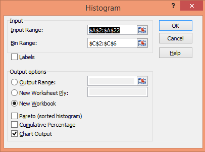
- Then select the input range and bin range in the Dialog box.
- Click new workbook and select the chart output check box then Click OK.
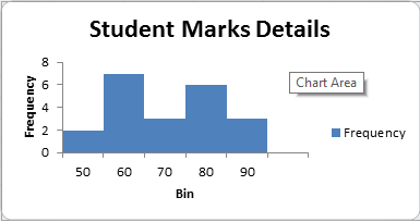
- Get the result below.

Customize and Improve Excel Histogram
We create a Histogram using the Analysis ToolPak and many excel functions. But it is also important to better visualization of your Histogram. We have another tutorial to modify the chart according to the requirement. For that, you can click here.
Remove Spacing between Bars
When you make a histogram, you want to an adjacent column in your Histogram chart without any gaps. To remove extra spaces between bars you can follow some steps as :
- Double-Click on the column of the Histogram chart.
- Click on the Format Data Series.
- On the Format Data Series, set the Gap width to zero.
- Get the Result.
Conclusion
Thus, in this post, you will learn how to create a Histogram chart in excel. We use the frequency function to create a Histogram in excel that returns the value that falls within the specified range (called bins). If you like this article then you can share with your friends and colleagues. We hope you will like this article and we'll update the information on the regular basis. You can also share on social media websites like facebook, twitter, and Instagram. If you have any query regarding this post then you can freely write your query in the comment section. We'll revert back to you as soon as possible.
No comments:
Post a Comment