How to Create a Chart in Excel: Hello everyone, Today we'll discuss how to Create a Chart or Graph in Excel. A chart is a tool to show the data graphically. It is used to show the series of data in a graphical format to understand the large quantity of data and it is necessary to make a Graph if anyone wants to analyze the data for submitting the business report. Excel sheet have lots of Chart or Graph and each chart has its own advantage. As we all know that excel worksheet contains a lot of data so it is difficult to interpret a large amount of data. Here we'll explain various types of chart or Graph with the various set of data and apply some changes on the Graph.
Create a Chart or Graph
To find highest and lowest value, increase and decrease number are very easy when the data is represented as a Chart in excel. You can create a chart to easy access of the data at a glance. Here we'll discuss some point about a chart so to create an Excel Graph follow some steps as:
- Select the source data of the chart or select row and columns cells.
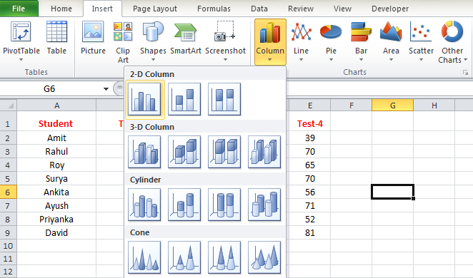
- Click Insert tab.
- In the chart group, select the desired chart category.
- Select the desired chart type from the Drop-down list.
- The chart will show in the worksheet.
We can create a various type of chart for visualizing excel data. Excel chart allow you to create a chart like a line chart, column chart, Pie chart, Bar chart, Area chart, Scatter chart, Surface chart or many another chart. We 'll discuss all types of chart one by one.
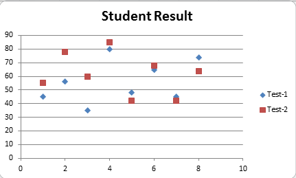
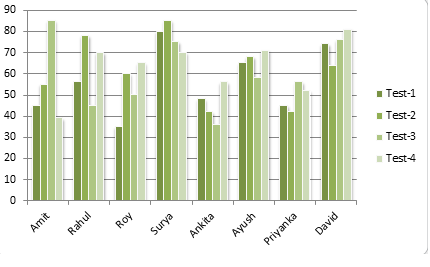
Column Chart
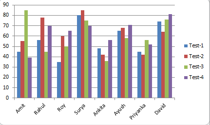
A column chart is used to compare values across categories and it uses vertical bars to represent the data. To create a column chart follow some steps:
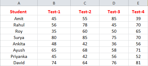
- Select the range of the input data or set of values.
- In the insert tab, click on a column from the charts.
- Select any column chart from the Drop-down list.
- Get the Result.
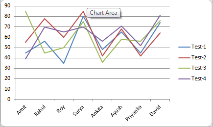
Line Chart
A line Graph in excel is used to display trends over time. The data points are connected with lines to see whether value are an increase or decrease over time. To create a Line Chart follow some steps as
- Select the range of the input data or set of values.
- In the insert tab, click Line from the chart group.
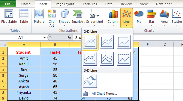
- Select any line chart from the Drop-down list.
- Get the Result.
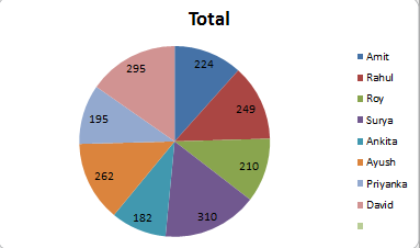
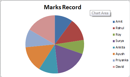
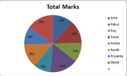
Pie Chart
Pie chart is used to display the contribution of each value to a total pie. Pie chart always uses one data series. To create a pie chart follow some steps:
- Select the range of the input data or set of values.
- In the insert tab, click Pie from the charts group.
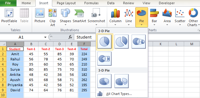
- Select any line chart from the Drop-down list.
- Get the Result.
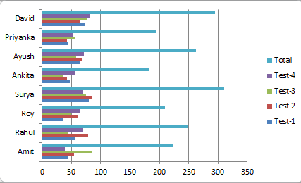
Bar Chart
Bar chart works same as column chart but it uses horizontal bars while column chart uses vertical bars. It is best to compare multiple values. To create a bar chart follow some steps:
- Select the range of the input data or set of values.
- In the insert tab, click Pie from the charts group.
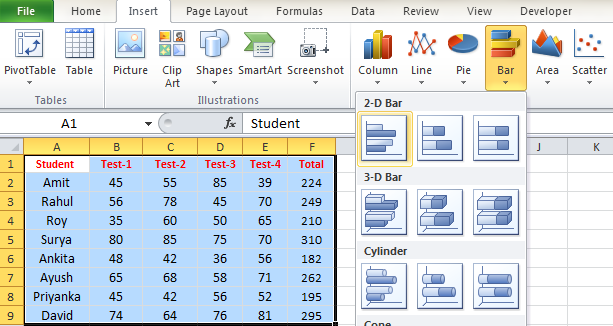
- Select any line chart from the Drop-down list.
- Get the Result.
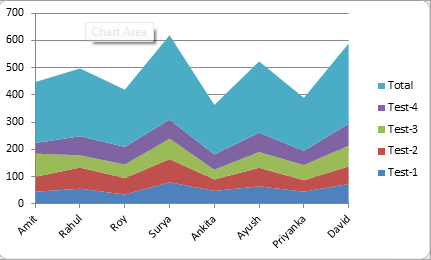
Area Chart
An area chart is similar to the line chart, except the areas under the lines are filled in. This chart shows differences between several sets of data over a period of time. For creating an area chart follow some steps:
- Select the range of the input data or set of values.
- In the insert tab, click Pie from the charts group.
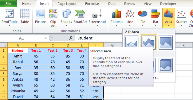
- Select any line chart from the Drop-down list.
- Get the Result.
Scatter Chart
Scatter chart is also known as X-Y chart and similar to Line chart. It is used to find out the relationship between two variable X and Y means to compare the pair of values. To create Scatter Graph follow some steps:
- Select the range of the input data or set of values.
- In the insert tab, click Pie from the charts group.
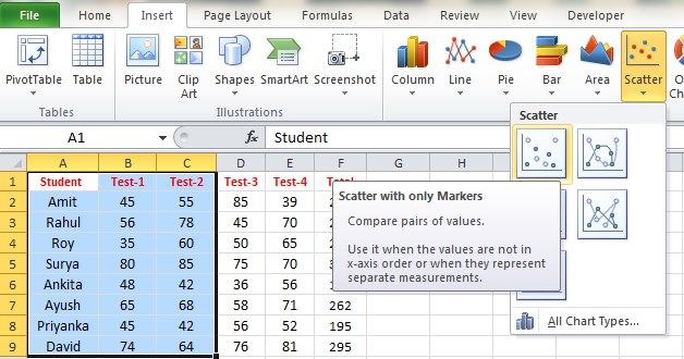
- Select any line chart from the Drop-down list.
- Get the Result.
Switch axis in Chart
Sometimes after creating the chart, data may not be grouped as you want. In this case, you need to change the axis or switch row and column or switch horizontal axis by vertical axis and vice versa.
To switch the axis follow some steps:
- Select the existing chart. The chart tools tab appears.
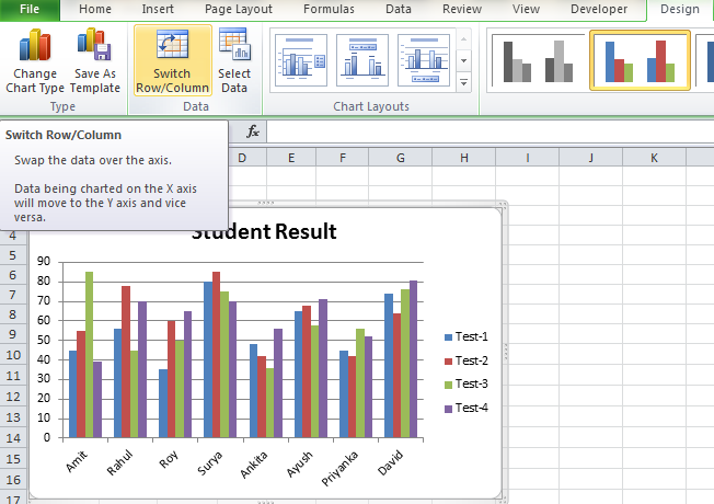
- In the design tab, Select Switch Row/Columns.
- Get the Result.
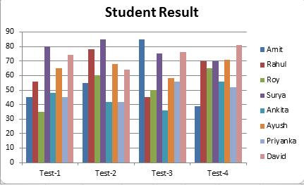
Chart Title
You can add the title in the chart. For add title follow some steps:
- Select the existing Chart. The Chart Tools tab appears.
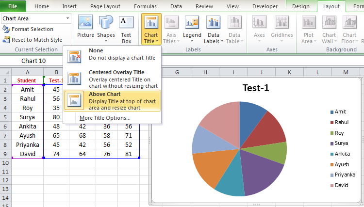
- In the Layout tab, click chart Title then Select Above Chart.
- Enter a Title as you want.
- Get the Results.

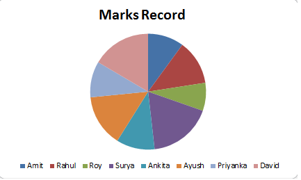
Legend Position in Chart
Legend Position identifies which data series each color in the chart represents. You can change the legend position where you want to display the legend. By default, excel legend appears to the right of the chart. You can move the legend to the bottom of the chart, left of the chart, Top of the chart or any location where you want to see. Let you want to move the legend to the bottom of the chart then follow some steps as:
- Select the existing excel chart. The chart tools tab appears.
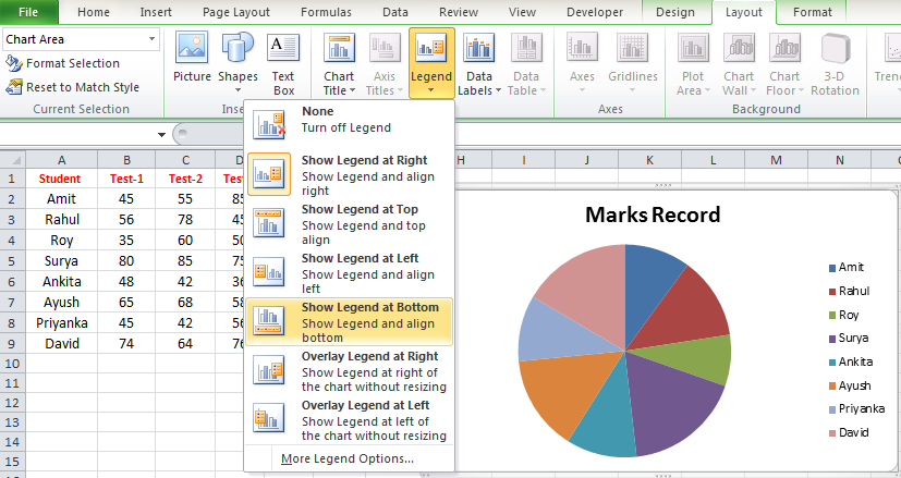
- In the Layout tab, Click Legend and select show Legend at Bottom.(you can also select any location)
- Get the result.
Move Chart to different Worksheet
You can move chart from one worksheet to another worksheet. For this process follow some steps as:
- Select the existing chart. The chart tools tab appears.
- Select the Design tab.
- Click on the move chart.
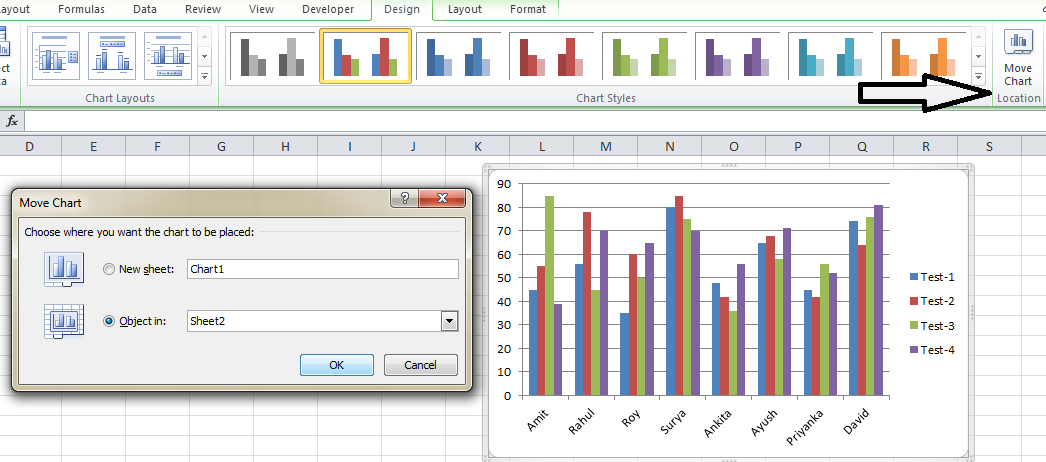
- A dialog box appears. Select the current location of the chart.
- Select the desired location of the chart.
- Click OK. The chart will display the new location.
Change Chart Style
You can also change chart style, follow some steps:
- Select the existing Chart. The Chart tool tab appears.
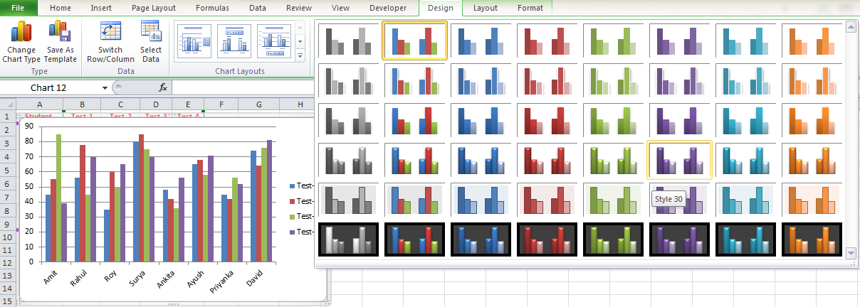
- Select the Design tab.
- Click the Move Drop-down arrow in the Chart style group and see all available charts.
- Select the Desired style.
- The chart will update to reflect the new style in the excel worksheet.
Add Data Labels to a Chart
Data label makes a chart easier to understand about a data series or its individual data point. It can use to focus reader attention on a single data series or data point. You can add labels to one series, all the series or one data point. To add Data Labels to a chart follow some points as discuss below:
- Select the existing chart. The Chart Tools tab appears.
- Click on the data series or chart series or whole chart.
- In the Layout tab, click Data Labels.
- Select any labels from the Drop-down list.(Depends on your need)
- Get the Results.(see the labels on your data series or chart)
Conclusion:
Thus, in this post, we discussed how to Create a Graph in Excel. As we know the graph is the best way to visualize data in a clear and understandable way and it is also helpful when we want to compare two value with the same situation. We hope that you like this post. If you like this post then you can share with friend, colleagues, and relatives. We'll update this post on the regular basis. You can also share this post on facebook, twitter, Instagram or other social media website. If you have any doubt regarding this post then you can write your query in the comment section. We'll revert back to you as soon as possible.
No comments:
Post a Comment