Monday 25 June 2012

Point of Sale Data – Supply Chain Analytics


I’ve spent a large part of my career working in Analytics for Supply Chain.  It’s an area blessed with a lot of data and I’ve been able to use predictive analytics and optimization very successfully to drive cost out of the system.  Much of what I learned in managing CPG supply chains translates directly to Retailer supply chains it’s just that there is much more data to deal with.  


If you have not read the previous posts in this series, please check out:
·         [Point of Sale Data –Basic Analytics] to see why you need to set up a DSR; and 
·         [Point of Sale Data – Sales Analytics] and [Point of Sale Data – Category Analytics] for some examples as to what else you can do with predictive analytics (and relatively basic POS data).

There is a lot that can be done with POS data from a supply-chain perspective.  Let’s start with a few examples:  
  • Use POS data to enhance your forecasting process. (At least recognize when the retailer’s inventory position is out of position as it will need a correction, thereby impacting what you sell to them.)
  • Measure store level and warehouse level demand uncertainty to calculate accurate safety stock and re-order point levels that make the Retailer’s replenishment system flow more effectively.  (see [How much inventory do you really need?]
  • Calculate Optimal order quantity minimums and multiples to reduce case picking (for you) and case sorting/segregation (for the retailer) 
  • Build optimal store orders to correct imbalances in the supply chain and/or correctly place inventory in advance of events. 
  • Where the retailer provides their forecast to you along with POS data:
    • monitor the accuracy and bias of the retailer’s forecasting process and help fix issues before they drive inappropriate ordering. 
    • build your own forecast (a “reference” model) from the POS data and look at where the 2 forecasts diverge strongly. Chances are that one of them is very wrong: if it’s the retailers forecast that’s wrong, remember that this is what drives your orders.
All of this is good and I certainly don’t discourage you from working on any of them but it seems to me that it may be missing the biggest problem   I may upset a few supply chain folks here (feel free to tell me so in the feedback section), but I’m going to say it as I see it - most retailer supply chain measurements do not help, in fact they distract from the one thing that is crucial – is the product available on the shelf? 

Unless the product is on the shelf where the shopper can find it, when they want to buy it, nothing else matters.  If you delivered to the retailer’s warehouse as ordered, in-full and on time, overall inventory levels at the retailer are within acceptable bounds, the forecast was reasonably accurate and the store shows that they we’re in stock that’s great – but it’s not enough.  The product MUST be on the shelf where the shopper can find it or you wasted all that effort.

And yet, it is very rare to see any form of systematic measurement of On-Shelf-Availability.  The few I have seen are so obviously biased as to be largely useless.  If you have the resources to do so and are interested in setting up a credible off-shelf measurement system, please, give me a call.  Otherwise, how can you know whether your hard work in product supply is really making a difference at this one moment of truth?  You need a good model to flag likely off shelf situations.  Do this well and you can make effective  use of field sales to correct the issues, work with your retailer’s operations team to help fix problem areas, identify planogram problems that are contributing to the issue or even examine whether some products or pack types are more frequently associated with off-shelf and could be changed .

It is possible to look at your sales and inventory history and try to “spot” periods where it looks as though the product was not on shelf.  Imagine a product that typically sells in multiple quantities every day in Store A that has not sold now for 10 days: the store reports having inventory all through this period, but no sales.  It seems very likely then that this product is not getting to the shelf.   For products that sell in smaller quantities it gets harder to guess how many days of zero sales would be unusual. 

You can build your own Off Shelf Alerts tool by (educated) guesswork and many people do.  Using some statistics you can get much “better” guesses.  Better guesses mean that you miss fewer real alerts, your alerts are correct more often and you find those issues with the biggest value to you.

Industry studies typically report that on-shelf positions range between the high 80’s to low 90’s in percentage terms.  Fixing this is probably worth 1%-3% in extra revenue.  What is that worth to you?  

Point of Sale Data – Category Analytics


If you haven’t already read the previous entries in this series, you may want to go back and check out [Point of Sale Data – the basics] to see why you really need a DSR to handle this data, and  [Point of Sale Data – Sales Analytics]  for some thoughts on analyzing sales drivers that are equally relevant to Category Management,

 As Category Manager you’re working with the retailer to help drive sales for the entire category.  You hopefully have access to the full data for your category (which could be substantially more than your account manager colleagues).  Let’s see how predictive analytics and modeling could help address some of your challenges:  How well are current planograms performing?  What is the best product assortment for each store?  How can you best balance customization of assortment by store with the work required to create that detail?

  • Understanding which stores are truly similar in terms of what sells and why in terms of demographics, geographies and local competition helps you manage your store list as a small set of groups (“clusters”) rather than trying to deal with each store individually or abandoning store-customization as too time consuming. 
  • Cluster analysis is a relatively simple statistical process (see Cluster Analysis - 101 ) and there are tools available from high-end statistical modeling packages to Excel Add-ins that can handle this process. Preparing the data appropriately, interpreting the results, and creating presentation ready output quickly is more of a challenge. I’m working on something to help with this…watch this space. 
  • Tools that help you find individual products that are not currently listed in a store but sell well in local competitor stores (from syndicated data) or in the retailers own “similar stores” help correct the assortment list.
    It’s relatively easy to find such “missing stars” when you know where to look. For example, stores in areas with lots of Hispanic households should probably stock every one of your top 10 Hispanic-oriented products. But this approach relies on you knowing these associations up front: the analytic approach scans your database to find all possible associations. 
  • Understanding product substitution and the shopper’s decision tree ensure that you add the right products onto the assortment without excessive cannibalization of existing products.Tools that handle assortment optimization are becoming more common now. Quite how well they work should depend heavily on how well you clustered stores into “like” stores and how accurate your decision tree is. 
  • Automating the assortment-selection and planogram-build processes can allow you to work at lower levels of detail and provide more finely tuned customization.  In many ways, this is not the area likely to generate the best return. The next best option is actually to bring in more temporary labor and it just does not cost that much to do so. However, what I see in reality is that category managers work extraordinary hours to try and get it done. They can’t work 10x normal hours so the work cannot get done to the depth that is possible. Neither can they handle changes late in the project with the same diligence and structure they brought to it initially – there is simply not enough time. There is at least one tool on the market for building planograms now and I may be tempted to build another J


Predictive analytics like these may seem complex and may only drive a few percentage points of incremental sales.  But then, what’s even 1% of incremental sales worth to you?  Worth handling a little complexity?

Point of Sale Data – Sales Analytics


I’m assuming that you now have a DSR (see [Point Of Sale Data - Basic Analytics] ) so you can manipulate the large quantities of data necessary to do this work, you have your routine reports automated and use the DSR for ad-hoc queries against the POS data. 

The DSR provides a great foundation for analytic work: use it to integrate multiple data sources, clean the data, handle very large data volumes as though it was all sat on your desktop and it will help you build reports that summarize that history with ease. Typically, the DSR does not provide much help for you with predictive-analytics. 

Let’s look at an example related to what really drives sales.   Do you know?  Can you quantify it?  Knowing these answers with quantified detail can help you better explain your sales history and plan for the future.  Better promotions, better pricing, supply chains that anticipate peaks in demand and make sure the product is on the shelf when it’s needed.  Here are some of the things that could drive your sales:
  • Pricing and Promotions
  • Competitor price gaps
  • Competitor promotional activity
  • On-shelf availability
  • Activity in competitor stores,
  • Weather: rain-fall, temperatures, hurricane warnings
  • Seasonal events,
  • Day of the week, Day of the month. 
  • Availability of disposable income  (government assistance  programs, pay cycles)
  • Placement in store, placement on shelf, product adjacency.
  • Store-area demographics

If you are fairly sure that just one thing drives the majority of your sales you can get a decent estimation of its impact visually with charts and tables.  Here’s an example:

In the USA, money for the government assistance program, SNAP (previously known as Food Stamps) is given out on specific days of the month.   Some States even make the entire month’s allowance available on just one day every month.  If your product is heavily impacted by the availability of SNAP dollars and you plot average sales by day of the month for a State you can clearly see the impact that this has on these days and the residual effects 2-3 days later.

If your sales are driven by multiple drivers, trying to tease apart the impact of each is going to need more complex analysis but in many, many cases, it can be done, either by moving the data across to external analytic routines or by embedding predictive-analytics directly into your DSR. 

Predictive Analytics like this may seem overly complex and will probably drive just a few percentage points of incremental sales.  But then, what’s 1% of incremental sales worth to you?  Enough to cope with a little complexity?


All posts in this series


Point of Sale Data – Basic Analytics


You've got access to Point of Sale Data…now, what are you going to do with it?

For the purpose of this blog entry, I’m assuming that we have daily aggregated data by product and by store.  We will certainly get measures of sales (both units sold and currency received).  We may also get other useful measures like inventory on-hand, inventory in-transit, store-receipts, mark-downs taken at the store and perhaps some data around warehouse activity too.


[Note: Aggregated data is not as potentially useful to us as individual transaction records but it’s more readily available so we’ll start with that.]

Now, this can be a lotof data (2 years of daily data for 10 measures, 100 products and 2000 stores is almost 1.5 billion data points) - you are not going to handle this in Excel or Access J.  If you forget about daily data and pull weekly aggregations and forget about wanting data by store you can reduce this a lot to a little more than 100,000 data points, BUT,  you have thrown away the opportunity to do much of the more value-added activities I will get to later.

Check out my blog post [Data Handling - the right tool for the job] and then set up your own Demand Signal Repository (DSR).    The DSR is designed to handle these data quantities and should enable standard reporting (as outlined above) straight out of the box. 

Now, you can figure out what you sold last week… or the last 4 weeks, or last 13 weeks, or Year to Date or the same periods for the prior year and I’m sure you will.  Aggregate this data with product hierarchies defined by the Retailer or with your own corporate hierarchies for discussion with your head-office.  You can calculate growth (or decline) and perhaps pricing and distribution.  You can even integrate some of your own corporate data (like shipment details) or externally audited data to combine into reporting.  

All very necessary, but rather basic and a long, long way from the value you could drive from the same data.  If you are looking to POS data to provide you with some real competitive advantage you will have to try a little harder.  The DSR is your cost of entry into this space and provides a solid foundation for deeper analysis, but ownership of a DSR does not, by itself, provide any competitive advantage.   What you do with this tool defines your competitive advantage.  Use it to automate a few reports that you used to pull manually and you saved a few hours a week and nobody, other than you, is going to notice.  You do need to do this but it’s not an end-point it just frees up enough time for you to consider taking bigger steps.

Use your DSR to find opportunities to: reduce off-shelf situations; or drive incremental sales; or reduce cost to supply and you are talking real money.  What is an incremental 1% of sales worth to you?  A lot more than the labor saved in report automation I bet.

In the following series of blog entries, I’ll suggest a few thoughts on more value-added activities.  Now, this will need incremental investment and additional skills but then you didn’t think competitive advantage would be free did you?


All posts in this series


Is the juice worth the squeeze?


I have heard this phrase a lot in recent months in a business context.  It’s so visual, I love it! 

It’s not quite enough though.  It’s pretty simple to understand that every project must be able to pay for itself and deliver a return.  Is the juice worth the squeeze?

It’s also true though that no organization has infinite resources of time or money.  If you have 10 projects that you could do but only enough resources to handle 3, you must prioritize those projects that help you meet your objectives (growth, profitability, market share).  What has the most bang for the buck? 

So with these 2 phrases in mind, it should now be easy…right? (Can you hear the sarcasm)?


In the past, I have been guilty of figuring out something can be done and then wanting to rush ahead to do it.  I have been there, I have done it and I have been surprised when a manager along the way was disinterested in my project or actively trying to shut it down. 

My enthusiasm was high, I had the capability to deliver but my ability to see the bigger picture from a business perspective was lacking.  Perhaps it’s a gap in my formal educational process that focused on business math and statistics rather than finance or managerial common sense?  I’m afraid I am not alone however; many analysts and process improvement folks seem to suffer from the same condition.

I think it’s fair to say that my working experience has largely corrected this: a spell in finance working on investment appraisal helped; running a logistics development team that generated more good ideas than we had capacity to work on helped too.  Being responsible for delivering financial results may have been the clincher. 

Analysts can be blinkered, I admit it, but this inability to see the big picture is not restricted to technical folks.  Managers see the complexity of analytics and have their own knee-jerk reactions.  Some perceive high-risk and immediately, perhaps unconsciously, discount the net benefit they are likely to receive.  In other cases I have seen an almost cult-like view that is without justification and disconnected from the results that could have been predicted  (“do this and good stuff will happen”).

In both cases managers are limited by their inability to estimate cost and/or benefit.  This is where a good analyst can really help. 

Note that for prioritizing most projects we do not need extreme precision in cost or benefit.  Really good projects do not have to scrape a return, the poor ones are usually struggling to hit whatever hurdles your finance team has put in place (e.g. NPV, IRR or payback).  What you need is a reasonable estimation backed up by sound analytics and whatever benchmarks you can lay your hands on.  Let’s take a few examples:

Project A:  Implementing an upgrade to the warehouse management system that converts all current paper-based processes to run on the existing computers. 
·         Based off a time-study, this is likely to save 10 minutes per order
·         The network of distribution centers process approximately 3000 orders per day
·         Cost to implement is estimated at 13 weeks of development time.
·         Warehouse labor costs about $25/worked-hour including all benefits
·         Development labor costs around $100/worked-hour including all benefits

Annual Savings:
10 x 3000 x 365 =  10,950,000 minutes/year
= 182,500 hours / year
= $ 4,562,500  / year         
            One-off Costs:
13 x 40 x 100 =  $52,000 / year
            Summary:
Without calculating NPV or IRR or Payback, I think we can clearly see that this would be a very, very good project.  Focus on the savings per person (forgetting that there are a lot of them and you can easily miss finding this opportunity)


Project B:  Report Automation: in our sales office, our analysts currently spend around 10 hours each, every week, preparing standard reports from Point of Sale (POS) data.  Automating these reports would be very popular, removing a tedious, repetitive part of the work.  Automation of each report takes about 1week of developer time. 
·         We have 10 sales analysts producing 40 reports
·         Sales analysts typically cost about $70/worked-hour including all benefits
·         Development labor costs around $100/worked-hour including all benefits
Annual Savings:
10 x 10 x 52 x 70                =  $364,000
One-off Costs:
40 * 40 * 100                       =  $160,000
             Summary:
Our annual savings do outweigh the costs… or do they?  For the savings to be real we have to stop paying for these hours (the equivalent of 2.5 people) or be able to reinvest them into other work that also generates a return.  Will we?  Frankly report automation is more reasonably justified by eradication of error and consistency of output that makes it easier to manage the thing you are reporting on – perhaps $Billions in sales.

Project C:  Use Point of Sale (POS) data to improve the forecast accuracy of the forecast we build for manufacturing planning.
·         Our current Forecast Accuracy is 75% for 1 month out.
·         We believe that incorporating POS data into the forecasting process could improve forecast accuracy.

(This is where your analyst should help, because you really need a lot more information, knowledge of how inventory buffers uncertainty, a decent model, a pilot and good benchmarks to figure out what this is worth)

A small pilot project using POS data and shipment history from the last 3 years to predict sales for last year suggests we could improve forecast accuracy by 3 – 7 percentage points.
Finished goods inventory is what buffers the manufacturing plant from uncertainty in demand.  With a better forecast you need less safety stock (see [How much inventory do you really need ?] for more details and a handy inventory model).  Using the inventory model:
·         The safety stock portion of our overall inventory is currently 1.8 weeks of supply.
·         A 5 percentage point improvement in forecast accuracy (from 75% to 80%) is worth about 0.4 weeks of supply.
·         From Finance we understand that 1 week of supply is worth approx. $12 million at cost.
·         Our weighted average cost of capital is 12% so projected working capital savings are ~ $1.4 million
·         We may be able to save on storage costs too (assuming they are variable not fixed).  Converting inventory in storage pallet positions we estimate saving about 20,000 pallet positions at a current cost of $5 per pallet per month.
(20,000 x 5 x 12)  = $1.2 million
·         Note: there are no ongoing savings to handling costs as we have reduced inventory not throughput (or sales would have dropped too).  A one-off saving in handling while inventory levels fall could be included but would be relatively immaterial.

Our pilot project has also helped us understand exactly how we can enhance the forecasting process with POS data and allowed us to cost the necessary changes to the forecasting system at approx. $1 million in one-off cost.   So we end up as follows:
Annual Savings:
$1.4 million in cost of working capital
$1.2 million in variable storage costs
One-off Costs:
$1 million
Summary:
This juice is (probably) worth the squeeze.  With a payback around 2.5 years it should be on our list of viable candidates.  Remember that the pilot said that accuracy improvement was in a range of 3 to 7 percentage points.  We evaluated the average here. At 3 points the costs will stay the same, the savings would only be 60% (not so good).
Does it give the best bang for the buck?  Well we will have to line it up against all other projects competing for our resources to know that.  My guess… probably not.
By the way, the inventory modeling exercise also said that you have 0.5 weeks of unnecessary inventory in the system.  Perhaps it would be better to start by trying to eradicate that.

The bottom line for you is that you should consider using this sort of Analytical Estimation in deciding which of your projects make the cut.  A good estimate is a lot better than a bad guess.

BTW - from recent experience, I can confirm that beetroot juice is most definitely not worth the squeeze J

How much inventory do you really need?

If you are following lean methodologies you will have encountered the concept of inventory as waste.   It’s something you have because you cannot instantly manufacture and deliver your product to a shopper when they want it, but not something that the shopper sees any value in.

I find that a very interesting idea as it challenges the reasons that you need inventory, and that’s definitely worthwhile.   However, many of these causes of inventory need more substantial changes in your supply chain (additional production capacity, shorter set-up times, multiple production locations) so as a first step, I suggest that you figure out what inventory your supply chain really needs and why.  Take out the truly wasted, unnecessary stock and then see what structural changes make sense.

Typically you can remove at least 10% of inventory while improving product availability. What’s that worth to you?  If that sounds a little aggressive, I can only say “been there, done that, got the coffee-mug”. (We didn’t do t-shirts).


I’m going to look at this from a manufacturer’s perspective and try to visualize for you why they need inventory and how to quantify the separate components.  Why does a manufacturer have inventory?  Let’s start with an easy one:

Cycle Stock is related to how often you add new inventory to the system.  Manufacturing lines typically make a number of different products, cycling through them on a reasonably consistent schedule.  “We make the blue-widgets around once a month”.  It may not be exactly a month apart and that’s not really important to us.  Once a month, in this case, a batch of blue widgets is made and added to inventory.  Over the course of the next month (or so) that inventory is consumed and inventory drops until we make another batch.  Over the course of 12 months it would look something like the example below.


Cycle Stock across time


Hopefully it’s not too hard to see that while “Cycle Stock” varies from 0 to about 30 days worth of demand, it will average out to about half-way between the peak and trough – roughly 15 days.  If you manufacture your product less frequently, say once every 2 months, Cycle Stock will peak at 60 days of demand and, on average, adds 30 days of inventory to your overall stock position.  If you manufacture your product once a week, Cycle Stock will peak at 7 days of demand and, on average, adds 3.5 days of inventory to your overall stock position.

If you want to reduce Cycle Stock you need to make your product more often.  That probably means reducing the time and lost production associated with line change-overs so changing more frequently is less painful.

Pipeline stock is slightly harder to explain but really easy to calculate.  Pipeline stock is inventory in your possession that is not available for immediate sale.  Good examples would be inventory that is in-transit, or awaiting release from quality testing: you own it but you can’t sell it yet.  Let’s say that from the point of manufacture it takes 3 days to move the product to your warehouse where it can be combined with other products to fulfill customer orders.  This has the effect of increasing your inventory by exactly … 3 days.  It really is that simple.  If you know how long inventory is yours but unavailable to meet demand, you know your Pipeline Stock.

If you want to reduce pipeline stock you need to reduce testing time post production, get your product to market faster even consider adding production capability nearer to your markets to reduce transportation time.

Inventory Build.  This is easy to describe but very difficult to model.   For products with large variations in sales volume across time (typically but not always due to seasonality) there may not be enough production capacity to manufacture everything you need just prior to the demand.    As long as the product can be stock-piled, the manufacturer just makes it earlier and holds it until its ready for sale.  If you want an example, think of Halloween Candy, it hasn’t really just been made in early October. 

So why is it so hard to calculate?  Well inventory models are typically built one product at a time but to know your production capacity availability you need to look at all products using shared resources and production-lines simultaneously and build a production plan that understands all your constraints and your planning policies.  Essentially, you need to build an entire (workable) production plan and that’s typically beyond the scope of an inventory modeling exercise.  Often the best place to get this is from your production planner.

If you want to reduce Inventory Build you may be able to do so by more effective production-planning , (Optimization models may be able to help here).  Alternatively you will need to add production capacity.

Safety Stock is the most complex part of the calculation but thankfully the math is not new and you can buy tools that do this for you.  You can’t make whatever you want whenever you want it (or you have little need for any inventory).  If I was to tell you now that we need another batch of “Red Doodas” it’s going to take some time to organize that.  Apart from purchasing raw and packaging materials you may need to break into the production schedule, reorganize line labor perhaps even organize overtime shifts.  You may say that you could that done in about 7 days by expediting, but you probably do not want to plan on having to expedite very much of your production.  So, think of something more reasonable, an estimate not too conservative but one that you could stick to most of the time…21 days ?  Let’s work with that and call it the “Replenishment Lead Time”.

Now, I want to set my safety stock so that it buffers me from most of the uncertainty I could encounter during the Replenishment Lead Time.  It seems highly unlikely that I will sell exactly what was forecast in the next 21 days.  If I sell less I am safe if unhappy.  If I sell more I need a little extra stock to help cover that possibility.  Similarly, even though I asked for 1000 “Red Doodas”, production does not always deliver what I asked for and sometimes it takes a little longer than it should too.  By measuring (or estimating) each of these sources of uncertainty and then combining them together we can get a picture of the total uncertainty you will face over the replenishment lead-time.  If we also know what level of uncertainty you want the safety stock to cover  we can calculate a safety stock level.

Typically the amount of uncertainty you wish it to cover is expressed in terms of the % of total demand that would be covered.  So, 99% means that safety stock would target fulfilling 99% of all product ordered.  The other 1% would, sadly, be lost  to back-orders; or future orders; or possibly lost completely.    As CPG case-fill rates (as measure of the proportion of cases fulfilled as ordered) are typically closer to 98%, 99% is actually rather high.

[Note: Don’t go asking for the safety stock to cover 100% of all uncertainty as this (theoretically at least) requires an infinite amount of safety stock]

Here’s our previous example with some additional variation (uncertainty) added in demand.  Safety stock has been set so that you should meet 99% of all demand from stock and production kicks off when we project inventory will drop below the safety stock level 30 days ahead.


Cycle and  Safety Stock across time

If there was no uncertainty the inventory would have a low point at exactly the safety stock level with production immediately afterwards.  Clearly actual sales did not turn out exactly as forecast.  Sometimes we sell less (and inventory is a little high when production kicks in).  Sometimes we sell more and sales start to use up the safety stock.

The safety stock level is intended to buffer most of this uncertainty, but as you can see, inventory does occasionally drop to 0 and (for very short periods of time) you would not have enough inventory to meet all orders.  On the days when this happens you will short a lot more than more than 1% of the ordered quantity but over time this would average out to about 1%.

If you want to reduce Safety Stock you have a few options.  Remember that they key inputs are:
·         Replenishment Lead-Time
·         Demand Uncertainty
·         Supply Uncertainty
·         % of uncertainty you want to cover.
If you can reduce any of these, your safety stock will come down.
I've embedded a simple inventory model below that you can use to experiment with the various inputs that drive your need for inventory.

Once you have set up the inputs appropriately for your business take a look at what a change to any of these inputs would do for total inventory.  What if you can:
·         improve Forecast Accuracy by 5 points;
·         reduce Replenishment Lead-Time by 1 week;
·         reduce you Cycle Time by 50%;
·         reduce Pipeline Length by 25% ?


Notes
Uncertainty of demand is typically measured by “forecast accuracy”.   There are some variations on the calculation of forecast accuracy but here I am using it as (1 – [Mean Absolute Percentage Error]) measured in monthly buckets.   [Mean Absolute Percentage Error] may seem a little scary, but it actually does exactly what it says, it’s the average, absolute error as a % of the forecast. (Absolute errors treat negative values as positive)


Forecast accuracy is typically measure in fixed periods that are relevant to you.  These may be close to but typically not the same as your Replenishment Lead-Time, so the model will try to estimate the value it needs from the standard metric.


If you are not already measuring your own forecast accuracy, you really do need to start.  A forecast with no sense of how accurate it is, is (relatively) useless.


Disclaimer:  This tool is a reasonable guide  and should give you a good sense of what is driving your need for inventory and what you might do to reduce it.  Ultimately though, its limited by the complexity I wanted to include in the Excel model it’s based off and of course it can only handle one product at a time.   Don't use it to build your inventory policies - invest in the real thing.

Saturday 23 June 2012

Activity-Based Costing Vs Traditional Absorption Costing (Critical Review)

By Jackie, Researcher
Topic: Education
Area of discussion: Cost & Management Accounting

The objectives of this research are to find out which method is considered the best method to allocate indirect costs (i.e to generate relevant cost information for decision making purposes), the correct ways on how to calculate it (steps by steps guide is given below plus an additional real question taken from LCCI as an extra revision purposes), to explain what are the differences between activity-based costing and traditional absorption costing system and how to use a “quick check” method of which I designed myself (to check whether the computed answers are correct or not?).

Introduction
Generally, both methods are used to calculate the cost of production. There are no differences between these two methods in finding material costs and labour costs. Their major concern is how to allocate the overhead costs to the cost of production. Ideally, using Activity-Based Costing is better than Traditional Absorption Costing as it is more accurate, reasonable and appropriate. This is because Activity Based Costing system uses both volume-based and non-volume-based cost drivers, while Traditional Absorption Costing system uses only volume-based cost drivers. Examples of volume-based cost drivers include: units of output, direct labour hours and machine hours while examples of non-volume-based cost drivers include:  numbers of production inspection, number of machine set-up, number of stock requisition and etc.

Let’s take a look at this example:


Based on the question above, single-stage traditional absorption costing system applies, whereby we need to total up all the overheads cost and then divide it by the total level of activity.  For this question the level of activity will be the total number of machine hours. After dividing it, we will get the overheads cost per one unit of activity (i.e. production overhead absorption rate). Then, the final step is to allocate this rate to the products by multiplying it with the number of machine hours used by a particular product. See below.


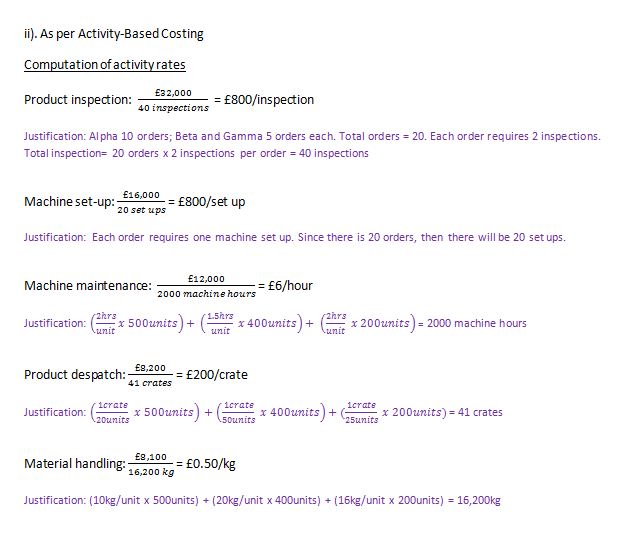
For Activity-Based Costing, since the separate cost activities are already given, then we only need to divide the cost of each activity with their respective cost drivers in order to find the activity rates. Cost driver is the factor that causes a change in an activity cost. For example: number of inspections and number of set ups. See below.


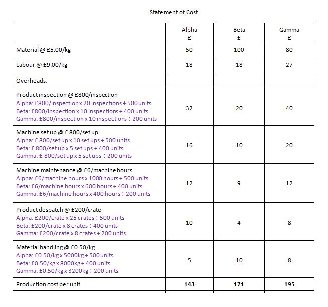
Then, the final step is to allocate those rates to products by multiplying them with the amount of cost drivers which will be used by them. For example, if product Alpha requires 20 inspections, then, 20 inspections x £800/inspection = £ 16,000 will be allocated to product Alpha. In order to find the product inspection overhead per unit, we have to further divide the amount by the Alpha’s total production output (units) which is 500 units. Then, £32 will be allocated to each unit of Alpha. Same method of calculation applies for the rest. See below.


A “quick check” method:
Although the cost of production per unit for each product is different in Traditional Absorption Costing and Activity-Based Costing, both methods will have the same total cost of production and because of this we can use this “quick check” method to check the answers.


References, additional readings and related links:

Gain an understanding of the basic concept of activity based costing

The basic concept of activity based costing

Activity Based Costing versus Traditional Costing

Activity Based Costing with worked example to compare with Traditional Costing

Saturday 16 June 2012

Unemployment in Malaysia [Updated, June 2012]


By Jackie, Researcher
Topic: Society (employability)

The objectives of this research are to find out the latest unemployment rate in Malaysia,to determine which is the worst affected sector, the reasons behind all these problems, suggestions to tackle those problems, discussion on the effectiveness of certain government’s plans and actions to cope with these problems so far, the employers' views regarding this issue and what should the fresh graduates do to secure a better job in the future.


Research Essay
INTI International College Subang

            Normally unemployment rate in developed countries is higher than developing countries due to higher competition. For example, in the last three quarters of 2011, United Kingdom’s unemployment rate has rose from 7.8% to 7.9% and followed by 8.3% respectively. At the same time, Malaysia’s unemployment rate has went up from 3% to 3.2% and followed by 3.3%, and was ranked at 170th place (see note 1) out of 198 countries based on their degree of severity (The Human Resource Ministry of Malaysia and CIA World Factbook, 2012). Observation reveals that youth unemployment rate (see note 2) is even greater than the overall unemployment rate for both of the countries suggesting that youngsters are facing more difficulties in finding jobs as compared to adults. In Malaysia, one of the badly affected sector is the nursing field (see note 3) whereby in 2010, more than 54% of the private nursing graduates were unemployed three to four months after graduating, compared to only 21.7% in 2008 (The Star, 2012). It is a worry situation as fresh graduates find themselves difficult to get employed despite having a solid academic qualification.


Comparison of Malaysia unemployment rate with United Kingdom unemployment rate in 2011.

                 Firstly, graduates lack of working experience and generic competencies. For instance, “jobless nurse” which is the most popular unemployment topic in Malaysia recently, Khoo and Liow (2012) agree that this is due to minimal qualification and zero practical training experience (see note 4). Ideally, organisationsprefer to hire people with relevant experience as they can spend lesser time and money to train them (Chong, 2005). Meanwhile, in a survey conducted by Ranjit (2005), 258 Malaysian private sector managers have identified certain soft skills which were lacking in Malaysian graduates such as planning, organizing, problem-solving, decision-making, leadership, creativity, critical thinking, conceptual and networking skills. According to his observation of job advertisements in two leading English newspapers in 2004, he found that the generic skills which are most sought-after by employers are interpersonal skills, oral and written communication, leadership skills, teamwork, problem-solving, creativity and computer literacy. As a solution, Malaysian government has allocated RM10.5 million to launch Graduate Employability Programme (GEP) in 2010 to enhance the skills and competencies of unemployed graduates. 


Generic competencies which are most sought-after by employers

                Secondly, poor command of English. In 2009, JobStreet.com has conducted an English Language Assessment (ELA) test whereby it had ranked Singaporeans first, Filipino second and Malaysians third. This has proven that Malaysian command of English is not up to standard. The survey revealed that 65% of employers have turned down job seekers due to poor command of English, which is the official business language for 91% of Malaysian companies. Chook (2009) states that ‘Proficiency in English influences one’s ability to communicate effectively, and to articulate ideas and solutions well. It also affects self-confidence, the ability to work in team and excel.’ As a solution, in 2003, English was readopted as the medium of instruction for Science and Mathematics in primary and secondary school but sadly, in 2009 government has made decision to revert back to Bahasa Malaysia starting from 2012 onwards, claiming that the step is ineffective as only 19.2% of secondary teachers and 9.96% of primary teachers were sufficiently proficient in English. Fortunately, 89 American educators were invited to teach English in Terengganu under English Teaching Assistantship (ETA) programme since 2009. This programme received positive outcome and therefore, ETA has been spreaded to Pahang and Johor while Education Ministry look forward to hire teachers from Britain and Australia also (The Star, 2012).

              Thirdly, graduates lack of positive attributes. In October 2011,JobStreet.com’s survey taken by 571 human resource practitioners reveals that unrealistically high salary or benefits demand is the top reason why fresh graduates were not hired. According to Siti (2011), many candidates were caught unprepared during interview and she elaborates further that ‘They attend interview without even basic knowledge about their potential employers. It makes a very bad first impression.’ In addition, some of the poor attitudes from the employers’ point of view are choosy about jobs, unwilling to learn, reluctant to serve beyond their own comfort zone, job-hopping (see note 5) and lack of self-confidence (see note 6) in finding a job.


Comparison of the expected salary with the actual salary received for the diploma and degree holders in 2011.

                Fourthly, there is a mismatch between the type of graduation degree and the requirements for the available jobs in the labour market. Naroden (2010) highlights that colleges and universities should provide their students with proper career guidance and information, ensure that their syllabus were relevant to the current industrial needs as well as conduct researches on the market needs to prevent students from taking irrelevant courses. It is better if they could identify the job available in the market before they start the students enrolment. Jeyakumar (2012) has pin point this situation where a freeze was made on the intake of new students in private institution until existing graduates secure jobs as the need for new nurses is only about 1,500 a year in private sector but on average 12,000 students will graduate annually.

                In addition, some external factors give negative impacts towards employment. For instance, the retirement age (see note 7) of private sector has raised from 55 to 60, with an option of four-year extension while for civil servants, it has raised from 55 to 58 (Manimaran, 2011). This will eventually diminish the needs for new recruitment to replace the senior employees. Besides, the extension of maternity leave (see note 8) from 60 days to 90 days seems unfavourable to some employers. They voice out that this will affect work operations and productivity whereby they have to find other people to replace their jobs temporarily, and have to pay additional costs for extra 30 days maternity leave. This may cripple business and cause losses (Indramalar, 2010).

                  In conclusion, fresh graduates must keep upgrading themselves from time to time with a mixture set of skills and lower down their expectation as well as change their negative attitude as competition is becoming stiffer plus the existing of external factors.  

Funny cartoon      
                                                              
Footnotes:
1.Unemployment rate (%) comparison and ranking between countries.
2.Youth unemployment rate in United Kingdom and Malaysia.
3.The Star Newspaper (3th February 2012), “Nursing job woes cut deep”.
4.The Star Newspaper (8th February 2012), “Attitude the biggest hindrance”; also please take note that   
   ‘Khoo’ is referring to Jeannie Khoo, Kelly Services marketing director for Singapore and Malaysia while 
   ‘Liow’ is referring to Malaysia’s Health Minister Datuk Seri Liow Tiong Lai.
5.The Star Newspaper (10th February 2012), “Youths with an attitude”: 12% of workers job-hop every year  
    especially in lower-rank jobs in factories, restaurants or hotels. The Star Newspaper (19thFebruary 2012),  
    “Costly job hopping”: Employers had to spend an average RM25,000 to RM30,000 to replace each   
     employee who quit.
6. JobStreet.com Employee Confidence Index, a measure of a jobseeker’s confidence in finding a job.
7.The Malaysian Insider (26thSeptember 2011), “Private sector retirement age to go up”.
8.The Star Newspaper (12th July 2010), “Demands of motherhood”.